Colour Therapy in the Garden - Healthy Life Essex
COLOUR THERAPY IN THE GARDEN
Can you imagine a world without COLOUR?
An autumn day without the fiery blaze of trees
A spring morning without yellow daffodils
An evening sunset without its marbled red horizon
Summer without azure blue skies
The healing power of colour
Colour has such a powerful influence on our moods and our physical well-being it would be hard to image living without it. It reflects our emotions, we ‘see red’ when we’re angry, we ‘feel blue’ when we’re sad, it can stimulate us or it can calm us down. Yet we take it for granted and don’t always think about how we can use it to improve our lives.As well as seeing light, our bodies absorb light energy. A long-term lack of natural light can affect our health so getting out of the office, especially those with fluorescent lighting, and into the garden is a positive step towards well-being.
What exactly is colour?
 Colour is light energy that travels from the sun (or other light source) in different wavelengths. This ‘visible light’, or what the human eye sees, is only a small part of the electromagnetic spectrum, which also includes radio waves, microwaves, radiation, x-rays and gamma rays. The longest wavelength we see is red, the shortest is violet.
 When these light waves fall on an object, such as a leaf, some light is absorbed and some is reflected – it is the reflected light that we see. A leaf looks green because pigments within the leaf, called chlorophyll, absorb all colours except green, which is reflected back to us. We see black when no colours are reflected and we see white when all colours of the spectrum are reflected.
How Do Our Eyes See Colour?
Have you come across the terms ‘advancing’ and ‘receding’ when used to describe certain colours? well there’s a physical reason for this & it’s due to the way our eyes have to adjust to focus colours onto the retina.
RED light naturally focuses at a point behind the retina, so the lens has to grow convex to focus the colour on the retina, this creates the sensation of pulling the colour nearer – so it ‘advances’.
BLUE light naturally focuses at a point in front of the retina, so the lens grows concave to focus, this creates the sensation of pushing the colour back – so it ‘recedes’
YELLOW-GREEN light naturally focuses directly onto the retina so this is the colour we perceive most acutely
Gardening with colour
The effects of colour and the way colours make us feel can be used to great effect within our gardens.
Changing our perception of space
We can alter the perceived size of our gardens not only by the colour of plants we choose but also the colour of our boundaries.
Make a short garden look longer by using warm, advancing colours close to the house and cool, receding colours at the back. Make a narrow garden seem wider by using receding colours at the sides. Paint solid fences in neutral grey-greens or blue-grey colours to take emphasis off the boundary and onto the garden within it.
Not only do paler fences push the boundary back but they also provide a wonderful backdrop to offset the colours and structures of plants.
Disguising ugly features or making attractive features stand out
There’s often something in our gardens that is not very attractive, such as an ugly neighbouring wall. The best way to disguise such features is to blend them into the background using a receding colour. Paint the wall the same colour as your fence or cover it with painted trellis.
 In this garden a flaking neighbouring wall has been painted and covered with grey-green trellising –here it marks a seating area under a large pergola but would have created a seamless boundary if the adjoining fence had been painted in the same colour.
The same grey-green colour is used on other trellising within the garden to unite the whole scheme.

needs a slightly sheltered position

If you have an ornate arch or other attractive structure you’d like to highlight, grow a vibrantly coloured climber over it, such as the Trumpet vine (Campsis x tagliabuana ‘Dancing Flame’) intertwined with evergreen Star jasmine (Trachelospermum jasminoides) for its sweet summer scent and deep red autumn leaf.
Mood enhancing planting schemes
Colour can dramatically alter the mood of a garden. Being very closely linked to the mind and emotions, colour has a subsequent physical effect on our bodies. Red increases our heart rate, our blood pressure and our muscular activity, it stimulates and excites us. Blue has the opposite effect, it reduces our rate of respiration and helps us to relax and think calmly.
Think about creating specific moods for different areas of the garden or changing the mood of a garden over the different seasons.
Helenium make a dramatic display
Excite the senses…..
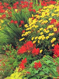
Bright oranges, reds and yellows are vibrant, stimulating and exciting and can create energy when used as planting schemes for children’s play areas or entertainment spaces.
Combining complementary colours (those opposite on the colour wheel) can have the most striking and vibrant effect, such as blue and yellow or red and green. Plants with red flowers look instantly striking against their own foliage.
Inspire your day……
Paler lemon yellows and buttery golden tones can be very uplifting – good around a breakfast patio for that early morning coffee & dose of inspiration.
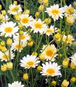
The cheeky, smiling heads of Anthemis tinctora
‘Sauce Hollandaise’ cheer you up in a instant!
Enjoy the velvety opulence of a late summer evening…..
Rich purple, dusky pink, terracotta and rusty reds can feel very warming, mellow and sumptuous. Many of these colours are at their best in late summer or early autumn flowering plants such as Achillea, Helenium and Chocolate Cosmos …..reminiscent of warm golden sunsets and rich velvet! A mood perhaps best created around an outdoor lounging area for evening drinks
Relax in tranquillity and contemplation…
Pale blue, soft purple, pale yellow, green, white and silver are all calming colours with the ability to make us feel relaxed. We all need an area to chill out and get away from every day chores – hence, tranquillity is the most frequently desired mood that people desire in their dream garden.
 Blue geraniums mingle with Iris and Fennel in this early summer garden. The light feathery texture of the fennel
adds to the softness of the scheme.
 Room105’s Chelsea show garden used a monochromatic scheme of cool minty greens and silver with a splash of rich red for interest. The overall feel was of harmonious tranquillity.
A border of soft purples, silver and green has a calm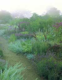
feel to it (the misty morning haze adds to the effect!)
This planting scheme would work well on the boundary
of a garden with its calm, receding colours giving the
illusion that the garden is more spacious than it really is
Brighten up a dark, shady corner
Pure white is a reflection of all light (with none absorbed), hence white flowers and those with pale pastel shades are very good at brightening up dark areas of the garden. Their luminescent qualities can be put to good effect in areas of the garden to be enjoyed at dusk.
.
Symbolisms of Colour
As well as the characteristics of colour and the way we see it, colour has many psychological associations that may influence your choice of planting scheme.…..
| Red | – passion, assertiveness, vigour |
| Pink | – femininity, affection, gentility, high spirits, good-health (‘in the pink’) |
| Orange | – strength & endurance, temptation, humility (Buddhism), love & happiness (China) |
| Yellow | – associated with the mind, intellect, creative energy & power, honour & loyalty (heraldry), life & truth (Hinduism & Christianity) |
| Green | – growth & hope, eternal life, love & fertility |
| Blue | – devotion, piety & sincerity, loyalty & chastity, faith |
| Purple | – sensitivity, sanctity, wealth & extravagance, self-esteem & confidence |
| White | – purity & innocence |
Experience the power of colour… plan your garden now for some powerful mood therapy next year
| Jill Crooks, Dip. Writtle College Garden Design RHS General & Advanced Certs. in Horticulture |
|
References:
The Healing Garden, Gay Search, published by BBC Worldwide
Gardens with Atmosphere, Arne Maynard with Sue Seddon, published by Conran Octopus.